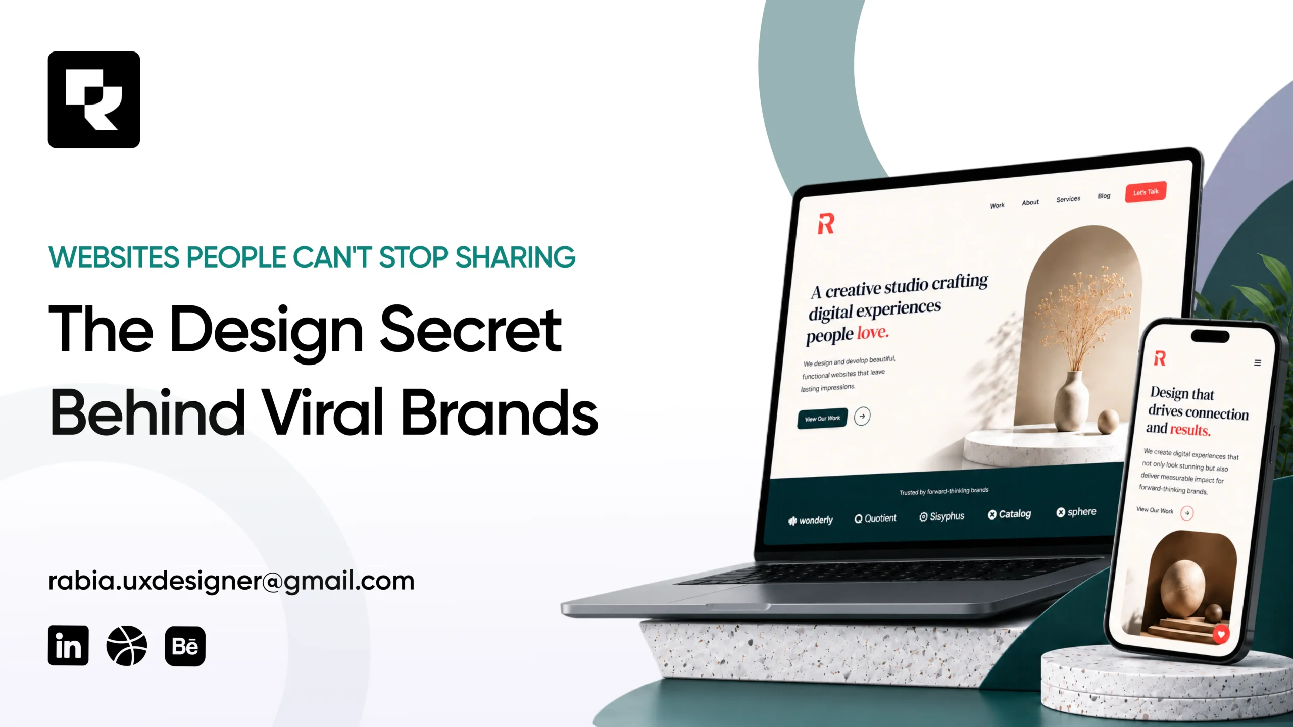
Some websites seem to spread on their own. They show up in a Slack channel, a group chat, or a “you have to see this” text, no ad budget behind them, just people passing the link along. Meanwhile, plenty of technically solid websites get zero attention outside the people who were already looking for them.
The difference usually isn’t luck or budget. It comes down to a handful of deliberate viral website design choices that make a site worth talking about. Once you know what they are, you’ll start spotting them everywhere, and you can borrow the same principles for a site of any size, including yours.
Why Do Some Websites Get Shared While Others Get Ignored?
There’s real psychology behind why people hit share. Wharton professor Jonah Berger studied hundreds of viral products, campaigns, and ideas and found six consistent triggers behind what spreads, a framework he calls STEPPS in his book Contagious: Why Things Catch On. Three of the six matter most when it comes to websites specifically:
- Social currency — people share things that make them look sharp, current, or in-the-know. An unusually well-designed website is the digital version of wearing something nobody else has yet.
- Emotion — surprise, delight, or awe pushes people to act immediately. A website that makes someone go “wait, what” is far more shareable than one that simply informs.
- Practical value — a genuinely useful interactive tool, like a calculator or generator, gets passed along because sharing it helps the person receiving the link too, not just the person sending it.
Notice that none of these are about the product being described. They’re about how the experience of the website makes a visitor feel, which is exactly why design, not just the offer or the copy, plays such a large role in whether something gets shared.
For a business, this isn’t just a vanity metric. Every share is a link, a mention, or a screenshot circulating with zero ad spend behind it, and search engines pay attention when real people keep linking back to a site organically. Shareable design and SEO end up reinforcing each other more than most business owners realize.
The Real Secret to Viral Website Design: One Unforgettable Moment
Look closely at almost any website that’s genuinely been talked about online, and you’ll usually find one thing in common: a single, disproportionately good moment, not uniform polish spread thin across twenty pages.
Awwwards has run its Site of the Year awards since 2009, and the winners tell the same story year after year. New Zealand studio Resn once took the top overall prize with a site called KPR, an interactive, story-driven experience built for a digital collectibles launch. It beat out entries from major names like Spotify, Gucci, and Netflix that year, not because it had more pages or a bigger production budget, but because it had one experience worth clicking through to the end.
That pattern holds even in industries known for playing it safe visually. A recent Awwwards Site of the Day went to Jeton, a fintech platform, for a scroll-based redesign that turned a typically dry onboarding flow into something closer to a guided tour. The lesson isn’t “add fancy animation.” It’s this: find the one moment a visitor is most likely to remember, and make that moment exceptional, even while the rest of the site stays simple.
You Don’t Need a Huge Budget, You Need One Bold Decision
None of this requires a six-figure agency budget or a team of specialist developers. The businesses that get this right usually make one bold, well-executed decision and leave the rest of the site clean and out of the way.
Restraint is part of the craft, not the opposite of it. If you want a deeper look at why pulling back often reads as more premium than filling every inch of a page, White Space in Design: Why Less Is More breaks down exactly how that works.
There’s also real research behind how fast first impressions form online, often cited at somewhere around 50 milliseconds, long before a visitor reads a single word. That means your one bold moment needs to live near the top of the page, not three scrolls down where most people will never see it.
How to Bring Shareable Design to Your Own Website
You don’t need a viral moment to benefit from viral-website-design thinking. These five apply at any budget:
- Pick one thing to make exceptional. Not the whole site, one hero moment: a striking headline animation, an unusual scroll effect, or an interactive element visitors wouldn’t expect from a business like yours.
- Write like a person, not a brochure. Personality in your copy is one of the cheapest ways to earn a screenshot. How to Write Website Copy That Converts covers how to do this without sounding unprofessional.
- Add a moment of delight somewhere unexpected. A playful 404 page, a hover state with a small surprise, or a loading animation with personality costs little to build and is exactly the kind of detail people screenshot.
- Make sharing effortless. A custom preview image and description for when your link gets pasted into Slack, X, or LinkedIn (this is controlled by your Open Graph tags) takes a developer an afternoon and directly affects whether your site looks worth clicking.
- Let your brand be recognizable out of context. A strong, consistent identity means a screenshot of your site is still clearly yours, even with no logo in frame. That’s the real return on investing in proper brand identity work, it’s what makes people remember whose site they just saw.
FAQ: Viral Website Design, Answered
Usually a combination of one exceptional, memorable moment and genuine emotional impact, surprise, delight, or awe, paired with design distinctive enough that sharing it reflects well on the person sharing it.
No. The businesses that pull this off well typically make one bold, well-executed decision rather than spreading a bigger budget thin across an entire site.
A good website is clear, fast, and converts visitors. A shareable one does all of that and adds a specific moment worth sending to someone else. The two goals aren’t in conflict, but share ability takes one extra, deliberate decision.
It depends on the interaction, but one well-executed feature, like a distinctive hero animation or a small interactive element, typically adds days rather than weeks to a standard project timeline, since the rest of the site can stay simple.
Virality isn’t something any designer can guarantee, and no website is going to “go viral” the way a TikTok clip might. But the underlying choices, one exceptional moment, real personality, and enough restraint to let that moment stand out, are things any business can apply on purpose. That’s the actual secret: it was never luck. It’s a design decision, made deliberately, instead of left to chance.
If you want a second opinion on where that one moment could live on your own site, book a quick call and we’ll walk through it together.