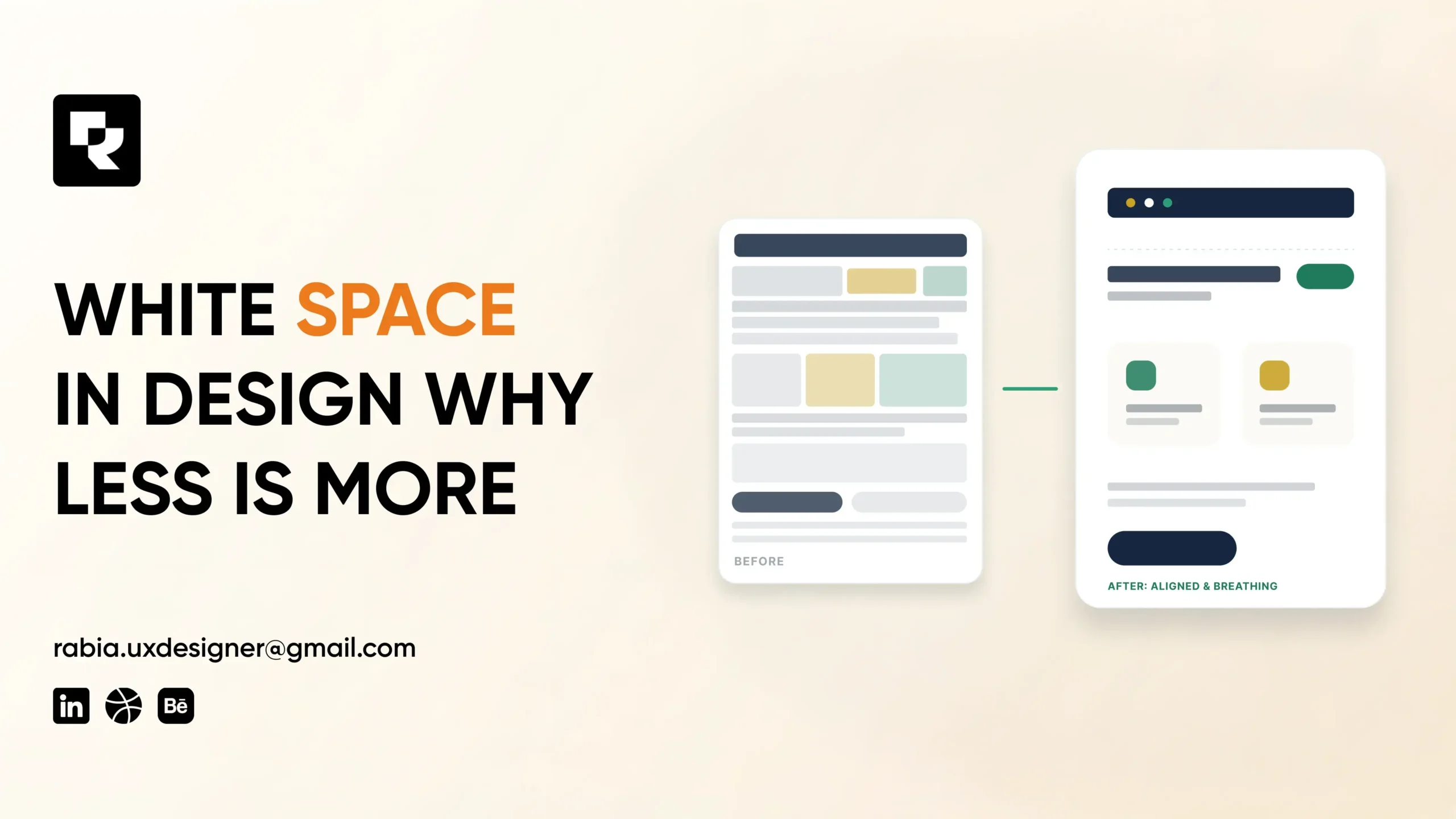
Empty Space Isn’t Empty. It’s Doing Work.
When people look at a clean, well-designed website or logo, they rarely notice what’s not there. But that empty space designers call it white space or negative space is one of the most powerful (and most underused) tools in visual design.
White space in design isn’t wasted space. It’s a deliberate choice that guides attention, improves readability, and signals confidence. Cramped, cluttered layouts do the opposite: they overwhelm visitors, bury your message, and quietly push people toward the “back” button.
If you’re building a brand, website, or product and you’re tempted to fill every inch with content, this is the one design principle worth understanding before you do.
What White Space Actually Means
White space refers to the empty areas between and around design elements text, images, buttons, logos. It doesn’t have to be white; it’s simply the “breathing room” in a layout.
There are two types:
- Micro white space — small gaps between lines of text, letters, icons, or buttons
- Macro white space — larger gaps between major sections, like margins, padding around a hero image, or the space around a logo
Both types work together to create visual hierarchy the order in which a viewer’s eye naturally moves through a page.
Why White Space Improves Design Performance
1. It Improves Readability
Text crammed too close together is harder to read and causes eye fatigue. Adequate spacing between lines (line height) and paragraphs makes content easier to scan which matters even more on mobile screens, where most traffic now happens.
2. It Directs Attention to What Matters
White space acts like a spotlight. Surrounding a call-to-action button, headline, or product image with extra space makes it stand out automatically no bold colors or flashing banners required. This is why premium brands (think Apple) use so much empty space around their products: it makes the product look more important.
3. It Builds Perceived Trust and Professionalism
Cluttered, busy layouts read as amateur or overwhelming. Clean layouts with generous spacing signal confidence, clarity, and professionalism all of which influence whether a visitor trusts your brand within seconds of landing on your site.
4. It Reduces Cognitive Load
Every extra element on a page requires mental effort to process. Too many competing elements text, buttons, images, banners force visitors to work harder to figure out what to do next. White space simplifies decision-making, which directly supports better user experience and conversions.
5. It Makes Your Brand Feel Premium
Luxury and high-end brands consistently use more white space in their marketing and packaging. It’s a subtle psychological cue: spacious design suggests confidence and quality, while cramped design suggests desperation to sell.
Where White Space Matters Most
In Logo Design: A logo surrounded by too many elements loses impact. Clean spacing around a mark makes it more memorable and versatile across applications something we cover in more depth in our breakdown of common logo mistakes that hurt sales.
In Website Layouts: Hero sections, product pages, and forms all perform better with intentional spacing around key actions. This directly ties into why poorly designed websites drive customers away cramped layouts are a major, often-overlooked culprit.
In Branding Systems: Consistent spacing rules across your logo, typography, and marketing materials reinforce a cohesive, professional brand identity something we explored in how a stunning brand identity can skyrocket your business.
In Mobile Design: Smaller screens have less room to work with, making white space even more critical for readability and tap-target accuracy.
Common White Space Mistakes to Avoid
- Filling every empty area “just because” treating white space as wasted real estate instead of a design tool
- Inconsistent spacing between similar elements, which creates visual imbalance
- Cramped call-to-action buttons with no breathing room, making them easy to miss or misclick
- Overcrowded hero sections with too much text, imagery, and competing CTAs at once
- Ignoring spacing on mobile, where cramped layouts hurt usability the most
How to Apply White Space Effectively
- Start with hierarchy. Decide what matters most on the page, then give it the most surrounding space.
- Use consistent spacing units. A structured spacing scale (e.g., multiples of 8px) keeps layouts visually balanced.
- Give CTAs room to breathe. Buttons surrounded by space get noticed and clicked more often.
- Don’t be afraid of “empty” areas. If a section feels sparse but easy to read, that’s usually a sign it’s working, not a problem to fix.
- Test on mobile first. Spacing that works on desktop can feel cramped on smaller screens check both.
Why This Matters for AI and Search Visibility Too
As AI-driven search tools increasingly evaluate page experience alongside content, clean, well-structured layouts with clear visual hierarchy are easier for both users and machines to parse. Google’s own guidance on page experience signals emphasizes clarity and usability as ranking factors and white space is foundational to both. According to Google’s Search Central documentation on page experience, a well-structured, easy-to-navigate layout contributes directly to how search engines assess content quality.
Nielsen Norman Group’s long-running usability research has also found that appropriate spacing significantly improves comprehension and reduces user error rates reinforcing that white space isn’t a stylistic preference, it’s a usability fundamental. You can read more on their findings on visual hierarchy at Nielsen Norman Group.
Frequently Asked Questions
White space (or negative space) is the empty area between and around design elements like text, images, and buttons. It’s used intentionally to improve readability, guide attention, and create visual balance.
Does white space have to be white?
No. White space simply refers to empty or unmarked space in a layout it can be any background color. The term describes the function (breathing room), not the actual color.
How much white space should a website have?
There’s no fixed rule, but generally 30-40% of a well-designed page consists of white space. The right amount depends on content density and brand style, but cramped layouts almost always underperform spacious ones.
Indirectly, yes. Clean, well-spaced layouts improve readability and user experience, which can reduce bounce rate and increase dwell time both signals search engines use to assess content quality.
Is white space the same as minimalism?
Not exactly. Minimalism is a broader design philosophy focused on simplicity, while white space is one specific technique used within minimalist (and many other) design styles.
If your website or brand feels cluttered, cramped, or overwhelming, a design audit can show you exactly where strategic white space could improve clarity, trust, and conversions.